


Blog · Carpet Education
How to Choose Carpet Color: Light, Tone, and What Lasts
How to choose carpet color is one of those decisions that feels simple until you get the sample home. The carpet that looked like a warm greige under showroom lighting reads almost pink against your cool gray walls. The color you loved in the store looks completely different by afternoon light in a north-facing bedroom.
Published October 18, 202613 min read

The problem is not your taste. It is that nobody explains the lighting science, the undertone mechanics, or the long-term performance reality before you buy.
This article covers all three, plus the room-by-room logic and resale angle most color guides skip entirely.
Choose a mid-tone warm neutral with subtle texture or fleck. It performs under every lighting condition, hides everyday soil better than light or dark solids, coordinates with the widest range of wall colors and furniture finishes, and appeals to buyers if the home is ever sold.
How Does Lighting Actually Change Carpet Color?
Lighting changes carpet color more than any other single variable, and showroom lighting is almost never the same as the lighting in your home.
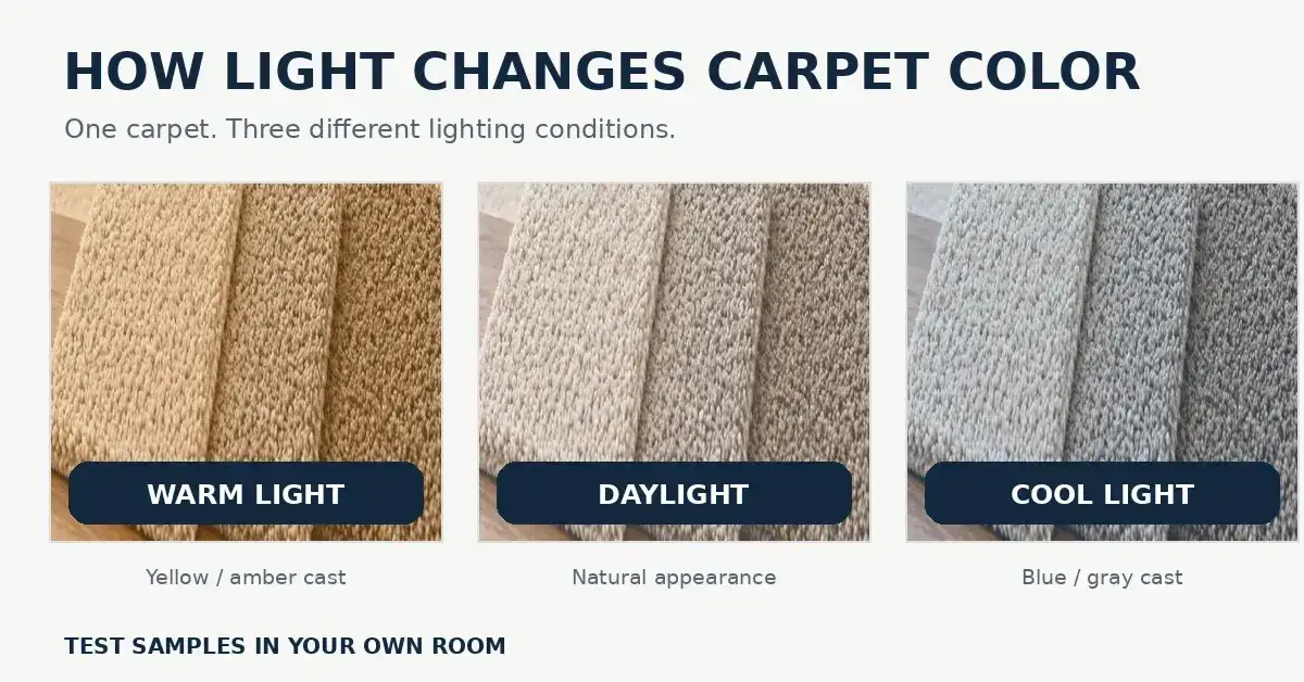
The American Lighting Association notes that warm-toned artificial lighting below 3,000 Kelvin shifts carpet color perception toward yellow and amber tones. The same carpet under cool daylight-balanced lighting above 5,000 Kelvin can read as gray or washed out. A carpet that looks like a rich warm tan under incandescent bulbs can look almost beige-gray under LED daylight bulbs in the same room.
Natural light direction compounds this. North-facing rooms receive indirect, cooler light throughout the day. Carpet in a north-facing room consistently reads cooler and slightly grayer than the same carpet in a south-facing room flooded with warm direct sunlight. What looks like a warm greige in a south-facing showroom can look noticeably cooler and more gray in a north-facing bedroom.
The phenomenon behind this is metamerism, the technical term for when two colors that match under one light source appear different under another. Carpet fibers and dyes are particularly susceptible to this because their texture creates micro-shadows that shift in appearance depending on light angle and color temperature.
When testing a carpet sample at home, place it on the actual floor, not propped against the wall. Observe it in the morning, at midday, in the afternoon, and under your artificial lighting at night. A sample that holds its character across all four conditions is a safe choice. A sample that looks dramatically different between morning and evening light in that specific room is warning you before you commit.
How Do Carpet Undertones Work and Why Do They Matter?
Carpet undertone is the secondary color you see when light hits the fiber at an angle. It is what makes a supposedly neutral carpet look pink, yellow, or green against certain wall colors, and it is the most common source of carpet color regret.
Every carpet color sits somewhere on the warm-cool spectrum. Warm carpets carry yellow, orange, peach, or red undertones. Cool carpets carry gray, blue, or green undertones. Neutral carpets are balanced enough that the undertone is minimal. The problem arises when a warm-undertoned carpet is installed against cool-toned gray walls, or when a cool-undertoned carpet goes into a room with warm wood tones and cream walls. The contrast between undertones is what creates the clash.
A homeowner who chose a carpet labeled simply as "natural beige" discovered after installation that it read distinctly pink against their cool-toned agreeable gray walls. The carpet was not pink in the showroom. The warm peach undertone in the fiber was invisible against the warm-toned showroom decor, but it became obvious the moment it met cool gray paint.
To identify undertone in a carpet sample, hold a white piece of paper next to it in natural light. The color that appears to shift toward the paper from the carpet is its undertone. If the carpet looks slightly pink against white, it has warm pink undertones. If it looks slightly blue or green, it has cool undertones.
Greige, the gray-beige hybrid that dominates residential carpet sales, works for most rooms because its undertone is deliberately balanced between warm and cool. It neither fights warm wood tones nor clashes with cool gray walls. According to Houzz residential design research, greige-range warm neutrals have consistently accounted for the majority of residential carpet purchases across three consecutive survey years precisely because they solve the undertone mismatch problem at both warm and cool wall color extremes.
Should Carpet Be Lighter or Darker Than Your Walls and Floor?
Neither lighter nor darker is universally right. The answer depends on what you need the room to do and how much maintenance you are willing to commit to.
Lighter vs Darker Carpet Comparison
| Factor | Lighter Than Walls | Darker Than Walls | Matched to Walls |
|---|---|---|---|
| Perceived room size | Larger, more open | Smaller, cozier | Neutral effect |
| Dirt visibility | High, shows everything | Moderate, shows dust | Depends on tone |
| Visual grounding | Weak, room feels airy | Strong, room feels anchored | Moderate |
| Resale appeal | Good if clean | Good in formal spaces | Strong and safe |
| Best suited for | Small bedrooms, formal rooms | Large living rooms, studies | Open floor plans |
Lighter carpet creates visual lift and makes a small or low-ceiling room feel larger. The trade-off is maintenance, light carpet shows soil, footprints, and pet hair almost immediately. It works best in low-traffic formal rooms or guest bedrooms that do not see heavy daily use.
Darker carpet grounds a large room visually and hides the most common types of foot-traffic wear. The trade-off is that it shows dust, light-colored pet hair, and lint very clearly, which is a significant maintenance consideration in homes with shedding pets.
For the floor relationship specifically, carpet that matches your flooring tone creates visual continuity in open-plan spaces. Contrast between carpet and adjacent hard flooring defines the room boundary intentionally, which works well in closed rooms but can create a jarring visual transition in open floor plans.
For most homes, the safest answer is carpet a half-tone lighter than the dominant wall color. This creates gentle contrast without the maintenance burden of very light carpet or the visual heaviness of carpet darker than both walls and floor together.
What Carpet Colors Hide Dirt, Stains, and Wear Best?
Mid-tone carpet in the greige to warm gray range hides everyday soil better than any other color category, and the reason is visual uniformity.
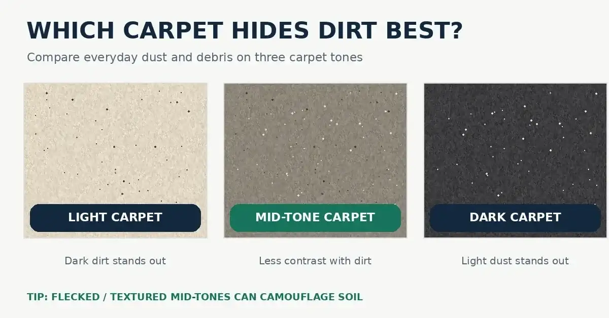
The Carpet and Rug Institute notes that medium-tone and multi-tonal carpet constructions retain their appearance longer between cleanings in moderate-traffic areas than solid light or dark alternatives. Very light carpet makes every particle of soil, dust, and pet hair immediately visible against the pale background. Very dark carpet makes dust and light-colored debris stand out against the dark ground. Mid-tone carpet falls in the visual range where everyday soil blends rather than contrasts.
Pattern and texture amplify this effect. The World Floor Covering Association reports that pattern carpet constructions hide the visual effects of wear and soil approximately 40% longer than solid-color carpet of equivalent fiber and face weight. The variation in a flecked or multi-tonal texture breaks up visual uniformity so that soil particles, minor staining, and early wear do not create the obvious contrast that appears on solid flat-pile surfaces.
For high-traffic areas including hallways, living rooms, and family rooms, a mid-tone warm gray or greige in a textured or flecked construction is the best combination of color and surface design for appearance longevity between professional cleanings.
Specific colors that consistently perform well in maintenance terms: warm gray, greige, taupe, and tan in a medium depth. These sit in the range where they are not so light as to show everything or so dark as to show dust and lint constantly.
What Carpet Color Adds the Most Resale Value?
Neutral carpet adds measurable resale value, and the data is specific about what neutral means to a buyer.
According to the National Association of Realtors, neutral flooring including carpet is among the top five features that increase buyer appeal during home sales, with neutral carpet consistently cited as preferable over bold or dated colors by surveyed home buyers. The operative word is neutral, not simply light or dark, but a color that reads as adaptable to a buyer's own furniture and decor choices.
Bold colors remove a home from buyer consideration entirely for anyone whose existing furniture conflicts with that color. A room with burgundy carpet tells a buyer they need to replace the flooring before moving in. A room with warm greige carpet tells a buyer it will work with whatever they bring. That difference shows up in offer prices and sale timelines.
Dated colors damage perception differently than bold colors. Colors strongly associated with a specific decade, whether avocado green from the 1970s, mauve from the 1990s, or certain jewel tones from the early 2000s, signal to buyers that other parts of the home may also be dated. The carpet becomes a proxy for the overall condition and modernity of the space.
For homes where resale is a consideration within the next five to ten years, warm neutral carpet in the greige to taupe range is the safest investment. It photographs well, coordinates with the broadest range of buyer furnishings, and does not date the home visually the way trend-driven colors do within a few years of purchase.
Room-by-Room Carpet Color Logic
Color choice does not work the same way in every room because lighting conditions, traffic levels, and how people use the space all change what color performs best.
Room-by-Room Carpet Color Recommendations
| Room | Recommended Color Range | Key Reasoning |
|---|---|---|
| Bedroom | Light to mid-tone warm neutral | Low traffic allows lighter tones; warmth aids rest |
| Master Bedroom | Mid-tone greige or warm gray | Versatile with changing decor; hides daily use |
| Living Room | Mid-tone to slightly deeper neutral | Traffic and entertaining demand better soil-hiding |
| Hallway | Mid-tone flecked or textured neutral | Highest foot traffic needs maximum soil concealment |
| Stairs | Mid-tone patterned or textured | Nose wear needs visual disruption to hide gracefully |
| Basement | Medium warm neutral, moisture-appropriate | Limited natural light makes darker tones feel heavy |
Bedrooms tolerate lighter carpet better than any other room because foot traffic is minimal and the primary users are consistent. A light warm gray or pale greige reads beautifully in a bedroom under warm artificial lighting at night, which is when bedrooms are most often visually evaluated.
Living rooms and hallways need the mid-tone range for maintenance reasons. Foot traffic in these areas is continuous and the soil load from shoes, pets, and daily movement is higher than any bedroom. The carpet color guide principle here is simple: the more traffic a room sees, the closer to mid-tone the color should be.
Stairs are a special case because the stair nose wears visibly faster than the rest of the tread. A patterned or multi-tonal carpet on stairs disguises early nose wear better than a solid color that makes the compressed and lightened fiber at each nose edge immediately obvious as wear sets in.
Basements benefit from mid-tone warm neutrals rather than very light or very dark. Most basements receive limited natural light, and dark carpet in a low-light environment makes the space feel significantly smaller and heavier than the same floor area would feel with a medium-toned surface.
What Carpet Color Choices Tell You About Long-Term Performance
These facts place carpet color selection in a practical long-term context.
According to the National Association of Realtors, neutral flooring consistently ranks among the top five buyer appeal features in residential home sales, with neutral-toned carpet specifically preferred over bold or trend-driven colors by the majority of surveyed buyers.
The Carpet and Rug Institute confirms that medium-tone and multi-tonal carpet constructions maintain visual appearance longer between cleanings than solid light or dark alternatives, because mid-tone colors do not create the visual contrast that makes everyday soil particles immediately obvious.
Houzz residential design research reports that greige-range warm neutrals have accounted for the majority of USA residential carpet purchases in three consecutive survey years, driven by the color's ability to coordinate with both warm and cool interior palettes without undertone conflict.
The American Lighting Association notes that warm artificial lighting below 3,000 Kelvin and cool daylight lighting above 5,000 Kelvin shift carpet color perception substantially in the same room, making in-home sample testing under actual lighting conditions essential before any carpet color purchase.
The World Floor Covering Association reports that patterned carpet retains its visual appearance approximately 40% longer than solid-color carpet of equivalent fiber and face weight under comparable traffic conditions, a performance advantage that applies regardless of the specific color chosen.
Common Questions About Carpet Color, Answered
What is the most popular carpet color right now?
+
Warm neutrals in the greige to taupe range dominate residential carpet sales in the USA. According to Houzz residential design research, this category has been the top choice for three consecutive survey years. The appeal is practical, greige coordinates with both cool gray walls and warm wood tones without undertone conflict, making it the safest single color category for any room.
What carpet color goes with gray walls?
+
Warm-toned carpet works best with gray walls because it provides contrast against the cool gray background without clashing. Greige, warm taupe, and sandy tan all pair naturally with medium to light gray walls. Avoid cool-toned beige or anything with a pink undertone, which will conflict with the blue-gray cast common in most gray wall colors.
How do I match carpet color to my furniture?
+
Match carpet undertone to furniture undertone rather than trying to match specific colors. Warm wood tones, cream upholstery, and gold or bronze accents work with warm-undertoned carpet. Cool gray upholstery, white painted furniture, and silver accents work with cool-to-neutral carpet. The goal is undertone harmony, not color matching.
What carpet colors make a room look bigger?
+
Light to mid-tone carpet makes a room feel larger than dark carpet. The lighter the floor surface, the more light it reflects, which expands the perceived size of the space. For small rooms specifically, pale greige or light warm gray carpet paired with walls of a similar or slightly deeper tone creates a cohesive, spacious feel.
What are timeless carpet colors that will not go out of style?
+
Warm neutrals in the greige to taupe range have proven timeless across multiple decades of interior design trends. They are not tied to any specific era or design movement. Avoid colors strongly associated with specific decades, including avocado green, mauve, and dusty rose. Mid-tone warm neutrals photograph well, coordinate broadly, and do not read as dated regardless of when they were installed.
What carpet color works best throughout a whole house?
+
A consistent mid-tone warm neutral used throughout the home creates visual flow between rooms and eliminates the jarring transition between different carpet colors at doorways. Greige or warm gray in a consistent tone and texture throughout a multi-room installation makes the home feel larger and more cohesive than using different carpet colors per room.
Is patterned carpet or solid carpet better for color choice?
+
Pattern outperforms solid in maintenance terms because it hides soil, wear, and debris approximately 40% longer according to the World Floor Covering Association. For color selection, pattern also allows you to introduce multiple tones at once, which gives more flexibility in coordinating with wall colors and furniture. Solid carpet is better for formal or minimal design schemes where visual simplicity is the priority.
How do I test a carpet color sample before committing?
+
Place the sample flat on the actual floor in the room, not propped against the wall. Observe it at four different times: morning, midday, afternoon, and evening under artificial light. A sample that stays consistent is safe. A sample that looks noticeably different from morning to evening in that specific room under its actual lighting is signaling a mismatch before you commit.
What carpet colors work best in bedrooms specifically?
+
Light to mid-tone warm neutrals work best in bedrooms because low traffic allows lighter tones to stay clean longer, and warm undertones contribute to the restful feel that bedrooms are designed for. Pale greige, warm gray, soft tan, and sandy neutrals all perform well. Avoid very dark carpet in small or low-light bedrooms, as it makes the space feel compressed and heavier than the room dimensions warrant.
What carpet color hides pet hair best?
+
Mid-tone carpet in a color that approximates your pet's coat color hides shedding best. A home with a golden retriever benefits from warm tan or sand-tone carpet. A home with a black Labrador benefits from darker mid-tone gray or charcoal carpet. Flecked and multi-tonal textures outperform solid colors for pet hair concealment regardless of the specific tone chosen.
The single most reliable carpet color decision any homeowner can make is choosing a mid-tone warm neutral with subtle texture or fleck. It is not the most exciting choice, but it is the one that performs consistently across every lighting condition, coordinates with the widest range of wall colors and furniture finishes, hides everyday wear and soil better than light or dark solids, and appeals to the broadest pool of buyers if the home is ever sold. How to choose carpet color comes down to this: understand your lighting, identify your undertone, and choose the middle of the tonal range. Everything else is refinement.
If you are in the Las Cruces NM area and need professional carpet cleaning to keep your carpet looking its best regardless of color, our team at Bliss Carpet Cleaning is ready to help.

Michael Sanders
Michael Sanders is a home care and cleaning industry writer covering carpet maintenance, flooring care, and household cleaning practices across the United States. His work focuses on practical, research-backed guidance — from stain and odor removal to deep extraction methods and indoor allergen prevention. Michael collaborates with cleaning professionals to ensure accuracy, and his writing reflects a genuine interest in helping homeowners make informed decisions about caring for their homes.


Whatever Color You Chose, Keep It Looking New
Professional cleaning protects your carpet's color and appearance for years to come. Serving Las Cruces, NM and the surrounding areas.
Call Now — Free Quote